提供queryset、manager和其他工具,以便与google可视化api轻松集成
django-gcharts的Python项目详细描述
##另一个针对django的google charts库需要安装gviz_u api库,该库可从google免费获得。~~~
-有关详细信息,请参见http://code.google.com/p/google-visualization-python/。
**更新:gviz_api库现已包括在内。**
##注:开发状态更新为beta版。单元测试的代码仍然不足,因此可能会发生不好的事情!**
请随时提交修补程序/请求;)
对他来说。我已经做了一些小的调整来让它对我的方法起作用。
尝试通过使用直接插入模型的自定义queryset和manager,
和一些包装器方法将queryset数据绑定到gviz_api库。
目标是"完全"支持queryset(使用聚合、连接、额外、注释等),以便我们可以使用熟悉的queryset语法收集数据。
演示站点预览了google visualization api中包含的一些图表,其中应该包含足够多的工作示例,以便您了解这些图表是如何工作的。
要开始演示站点,请按照以下步骤操作。
$git clone https://github.com/rhblind/django gcharts.git
$cd django gcharts
$python manage.py syncdb
$python manage.py initdata
$python manage.py runserver
配置35 35 35 br/>已安装的应用程序=(
…
‘gcharts’,
…
)
*`GoogleCharts\u API`-可选。默认值为1.1
*`googlecharts\u packages`-可选。应加载的包的列表。默认值仅为"corechart"。
对于最基本的图表
您只需要加载"corechart"包(如果未指定则为默认值)。
下面列出了不同包中可用的图表。
**请注意,每次`{%gcharts%}…{%endgcharts%}`
块已呈现。**
可选地,可以在{%render中指定特定图表的包…%}`标记为最后一个选项。
在这种情况下,标记应写为:`{%render"div_id""data""options""package name"%}`。这将导致
将包应用于当前{%gcharts%}…{%endgcharts%}`除了在settings.py.
*`corechart'中指定的那些图表之外,还包含这些图表
*[areachart](https://developers.google.com/chart/interactive/docs/gallery/areachart)
*[barchart](https://developers.google.com/chart/interactive/docs/gallery/barchart)
*[bubblechart](https://developers.google.com/chart/interactive/docs/gallery/bubblechart)
*[candlestickchart](https://developers.google.com/chart/interactive/docs/gallery/candlestickchart)
*[columnchart](https://developers.google.com/chart/interactive/docs/gallery)/柱形图)
*[组合键rt](https://developers.google.com/chart/interactive/docs/gallery/combochart)
*[折线图](https://developers.google.com/chart/interactive/docs/gallery/linechart)
*[折线图](https://developers.google.com/chart/interactive/docs/gallery/piechart)
*[折线图](https://developers.google.com/chart/interactive/docs/gallery/scatterchart)
*[草原艺术](https://developers.google.com/chart/interactive/docs/gallery/草原艺术)
*`gauge`
*[规格](https://developers.google.com/chart/interactive/docs/gallery/gauge)
*`geograart`
*[地球艺术](https://developers.google.com/chart/interactive/docs/gallery/geologiart)
*`表`
*[表](https://developers.google.com/chart/interactive/docs/gallery/table)
*`树映射`
*[树映射](https://developers.google.com/chart/interactive/docs/gallery/treemap)
\models.py###
将gcharts manager注册到要从中绘制图表的模型
from django.db import models
from gcharts import gchartsmanager
class mymodel(models.model):
此模型。
objects=gchartsmanager()
my_field=models.charfield(…..)
my_other_field=models.integerfield()
…
它们很畅销。
**models.py**
来自django.db import models
来自gcharts import gchartsmanager
类垃圾邮件(models.model):
name=models.charfield(最大长度=10)
…
…
cdt=models.datetimefield(auto_add_now=true,verbose_name="creation datetime")
**views.py**
from dateutil.relativedelta import relativedelta
from django.shortcuts import render_to_response
from django.template.context import requestcontext
from models import spam
def render廑chart(请求):
if request.method="get":
y()-relativeDelta(months=3)
#-values()用于提取感兴趣的字段
.values("date").annotate(count("id")).order_by()
E QueSET。javascript数据类型是自动设置的,
除了需要在dict中指定为:
{extra_name':{javascript data type':'label for field'}
-order是一个iterable,它设置列顺序,其中h数据应
呈现
-格式是一个dict{'field{'name':'expression'},其中expression是一个
有效的string.format()表达式。
spam json=qset.to_json(labels={"id_u count":"spam salled","date":{"date":"date},
顺序=("日期","id\u计数"),
格式化={"id\u count":"{0:d}垃圾邮件的单位"})
return render_to_response("sales_overviews/spamreport.html,{"spam_data":spam_json},
context_instance=requestcontext(request))
**spamreport.html**
…
{%load gcharts%}
{%gcharts%}
<;!--所有图表的全局选项-->;
选项={
宽度:500,
高度:300
};
<;!--克隆选项,适用于"垃圾邮件选项"——>;
spam\u opt=\u clone(options);
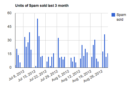
spam\u opt.title="上3个月售出的垃圾邮件数量";
{%options spam\u opt%}
kind:"ColumnChart",
选项:垃圾邮件选项,
{%inoptions%}
{%呈现"垃圾邮件图表""垃圾邮件数据""垃圾邮件选项"%}
{%endgcharts%}
<;div id="垃圾邮件图表">;
<;!--垃圾邮件数据图表的容器-->;
<;/div>;
…
应输出类似的内容。
-有关详细信息,请参见http://code.google.com/p/google-visualization-python/。
**更新:gviz_api库现已包括在内。**
##注:开发状态更新为beta版。单元测试的代码仍然不足,因此可能会发生不好的事情!**
请随时提交修补程序/请求;)
对他来说。我已经做了一些小的调整来让它对我的方法起作用。
尝试通过使用直接插入模型的自定义queryset和manager,
和一些包装器方法将queryset数据绑定到gviz_api库。
目标是"完全"支持queryset(使用聚合、连接、额外、注释等),以便我们可以使用熟悉的queryset语法收集数据。
演示站点预览了google visualization api中包含的一些图表,其中应该包含足够多的工作示例,以便您了解这些图表是如何工作的。
要开始演示站点,请按照以下步骤操作。
$git clone https://github.com/rhblind/django gcharts.git
$cd django gcharts
$python manage.py syncdb
$python manage.py initdata
$python manage.py runserver
配置35 35 35 br/>已安装的应用程序=(
…
‘gcharts’,
…
)
*`GoogleCharts\u API`-可选。默认值为1.1
*`googlecharts\u packages`-可选。应加载的包的列表。默认值仅为"corechart"。
对于最基本的图表
您只需要加载"corechart"包(如果未指定则为默认值)。
下面列出了不同包中可用的图表。
**请注意,每次`{%gcharts%}…{%endgcharts%}`
块已呈现。**
可选地,可以在{%render中指定特定图表的包…%}`标记为最后一个选项。
在这种情况下,标记应写为:`{%render"div_id""data""options""package name"%}`。这将导致
将包应用于当前{%gcharts%}…{%endgcharts%}`除了在settings.py.
*`corechart'中指定的那些图表之外,还包含这些图表
*[areachart](https://developers.google.com/chart/interactive/docs/gallery/areachart)
*[barchart](https://developers.google.com/chart/interactive/docs/gallery/barchart)
*[bubblechart](https://developers.google.com/chart/interactive/docs/gallery/bubblechart)
*[candlestickchart](https://developers.google.com/chart/interactive/docs/gallery/candlestickchart)
*[columnchart](https://developers.google.com/chart/interactive/docs/gallery)/柱形图)
*[组合键rt](https://developers.google.com/chart/interactive/docs/gallery/combochart)
*[折线图](https://developers.google.com/chart/interactive/docs/gallery/linechart)
*[折线图](https://developers.google.com/chart/interactive/docs/gallery/piechart)
*[折线图](https://developers.google.com/chart/interactive/docs/gallery/scatterchart)
*[草原艺术](https://developers.google.com/chart/interactive/docs/gallery/草原艺术)
*`gauge`
*[规格](https://developers.google.com/chart/interactive/docs/gallery/gauge)
*`geograart`
*[地球艺术](https://developers.google.com/chart/interactive/docs/gallery/geologiart)
*`表`
*[表](https://developers.google.com/chart/interactive/docs/gallery/table)
*`树映射`
*[树映射](https://developers.google.com/chart/interactive/docs/gallery/treemap)
\models.py###
将gcharts manager注册到要从中绘制图表的模型
from django.db import models
from gcharts import gchartsmanager
class mymodel(models.model):
此模型。
objects=gchartsmanager()
my_field=models.charfield(…..)
my_other_field=models.integerfield()
…
它们很畅销。
**models.py**
来自django.db import models
来自gcharts import gchartsmanager
类垃圾邮件(models.model):
name=models.charfield(最大长度=10)
…
…
cdt=models.datetimefield(auto_add_now=true,verbose_name="creation datetime")
**views.py**
from dateutil.relativedelta import relativedelta
from django.shortcuts import render_to_response
from django.template.context import requestcontext
from models import spam
def render廑chart(请求):
if request.method="get":
y()-relativeDelta(months=3)
#-values()用于提取感兴趣的字段
.values("date").annotate(count("id")).order_by()
E QueSET。javascript数据类型是自动设置的,
除了需要在dict中指定为:
{extra_name':{javascript data type':'label for field'}
-order是一个iterable,它设置列顺序,其中h数据应
呈现
-格式是一个dict{'field{'name':'expression'},其中expression是一个
有效的string.format()表达式。
spam json=qset.to_json(labels={"id_u count":"spam salled","date":{"date":"date},
顺序=("日期","id\u计数"),
格式化={"id\u count":"{0:d}垃圾邮件的单位"})
return render_to_response("sales_overviews/spamreport.html,{"spam_data":spam_json},
context_instance=requestcontext(request))
**spamreport.html**
…
{%load gcharts%}
{%gcharts%}
<;!--所有图表的全局选项-->;
选项={
宽度:500,
高度:300
};
<;!--克隆选项,适用于"垃圾邮件选项"——>;
spam\u opt=\u clone(options);
spam\u opt.title="上3个月售出的垃圾邮件数量";
{%options spam\u opt%}
kind:"ColumnChart",
选项:垃圾邮件选项,
{%inoptions%}
{%呈现"垃圾邮件图表""垃圾邮件数据""垃圾邮件选项"%}
{%endgcharts%}
<;div id="垃圾邮件图表">;
<;!--垃圾邮件数据图表的容器-->;
<;/div>;
…
应输出类似的内容。

欢迎加入QQ群-->: 979659372

