绘制散点图时的问题
我正在使用 matplotlib.pyplot.scatter 来绘制一些简单的散点图。但是出现了一些问题,我找不到解决办法。下面是绘制这个散点图的代码:
 # xActA, yActA, xActQ, yActQ are all lists with same dimensions.
ax1 = scatter(xActA, yActA, color = 'blue',s = 20, label = 'Answers', linestyle = 'o')
ax2 = scatter(xActQ, yActQ, color = 'black', s = 20, label = 'Questions', linestyle = 'o')
ax1.set_label('Answers')
ax2.set_label('Questions')
xscale('log')
yscale('log')
title('User activity')
xlabel('Number of posts')
ylabel('Number of users')
legend()
f1.show()
f1.savefig('figure7_test.png')
虽然没有错误提示,但图上却没有任何点。

这是数据:
xActA = [0, 1, 2, 3, 4, 5, 6, 129, 8, 9, 10, 11, 12, 13, 14, 15, 16, 17,
             18, 147, 20, 21, 22, 23, 24, 25, 26, 27, 28, 29, 30, 31, 32, 33,
             35, 36, 39, 40, 7, 45, 46, 49, 50, 52, 53, 183, 59, 63, 65, 69,
             70, 72, 73, 55, 77, 78, 84, 85, 43, 215, 88, 100, 94, 131, 167,
             19, 375, 122, 125, 149]

  len(xActA) = 70

  yActA = [1212, 822, 194, 94, 61, 44, 24, 1, 26, 20, 11, 16, 10, 8, 5, 8,
             5, 5, 3, 1, 4, 4, 5, 3, 2, 3, 4, 3, 1, 2, 2, 3, 2, 1, 2, 2, 2, 2,
             31, 2, 1, 1, 2, 2, 1, 1, 1, 1, 1, 1, 1, 1, 1, 1, 1, 1, 1, 1, 1,
             1, 1, 1, 2, 1, 1, 2, 1, 1, 1, 1]

  len(yActA) = 70

  xActQ [0, 1, 2, 3, 4, 5, 6, 7, 8, 9, 10, 11, 12, 13, 14, 16, 17, 18, 19, 20, 21, 22, 23,    24, 25, 29, 36, 40, 45, 48, 50, 55, 67, 124]
  len(xActQ) = 34

  yActQ [204, 242, 150, 50, 49, 27, 5, 9, 4, 2, 6, 3, 2, 8, 4, 5, 1, 3, 3, 1, 3, 2, 2, 2, 1, 1, 1, 1, 1, 1, 1, 1, 1, 1]
  len(yActQ) = 24
第二个错误是用另一个数据集时出现的。我正在检查数据……抱歉之前的描述不够清楚。
2 个回答
3
问题出在 linestyle='o' 这部分。这里的 'o' 是一个 marker(标记),而不是 linestyle(线条样式),所以你需要把 linestyle 替换成 marker,在你前两行代码中进行修改。
你可以在 这里 查看 scatter 的所有标记类型。
2
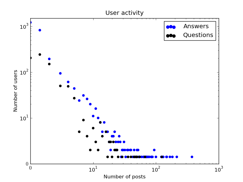
如果你仔细看看你的数据,会发现大部分数据点都在图表区域之外(x=[1e2:1e3]; y=[1e2:1e4])。如果你用线性刻度来显示数据,虽然能看到一些散点,但看起来并不太清楚。不过,如果你把刻度改成'symlog',然后用'xlim'和'ylim'来设置x和y的范围,就可以解决这个问题了。当然,运行'scatter'的时候要确保标记设置为'o'。可以查看完整的代码。
from pylab import *

# The data
xActA = array([0, 1, 2, 3, 4, 5, 6, 129, 8, 9, 10, 11, 12, 13, 14, 15, 16, 17,
    18, 147, 20, 21, 22, 23, 24, 25, 26, 27, 28, 29, 30, 31, 32, 33, 35, 36,
    39, 40, 7, 45, 46, 49, 50, 52, 53, 183, 59, 63, 65, 69, 70, 72, 73, 55, 77,
    78, 84, 85, 43, 215, 88, 100, 94, 131, 167, 19, 375, 122, 125, 149])
yActA = array([1212, 822, 194, 94, 61, 44, 24, 1, 26, 20, 11, 16, 10, 8, 5, 8,
    5, 5, 3, 1, 4, 4, 5, 3, 2, 3, 4, 3, 1, 2, 2, 3, 2, 1, 2, 2, 2, 2, 31, 2, 1,
    1, 2, 2, 1, 1, 1, 1, 1, 1, 1, 1, 1, 1, 1, 1, 1, 1, 1, 1, 1, 1, 2, 1, 1, 2,
    1, 1, 1, 1])

xActQ = array([0, 1, 2, 3, 4, 5, 6, 7, 8, 9, 10, 11, 12, 13, 14, 16, 17, 18,
    19, 20, 21, 22, 23, 24, 25, 29, 36, 40, 45, 48, 50, 55, 67, 124])
yActQ = array([204, 242, 150, 50, 49, 27, 5, 9, 4, 2, 6, 3, 2, 8, 4, 5, 1, 3,
    3, 1, 3, 2, 2, 2, 1, 1, 1, 1, 1, 1, 1, 1, 1, 1])

# The plots
close('all')
f1 = figure()
ax1 = scatter(xActA, yActA, color='blue', s=20, label='Answers', marker='o')
ax2 = scatter(xActQ, yActQ, color='black', s=20, label='Questions', marker='o')
xscale('symlog')
yscale('symlog')
xlim([0, 1e3])
ylim([0, 1.5e3])
title('User activity')
xlabel('Number of posts')
ylabel('Number of users')
legend()
f1.show()
f1.savefig('figure7_test.png')
这几行代码就能给你生成这样一个漂亮的图: 
(来源: nublia.com)