如何在Python中计算点过程的残差
我正在尝试用不同的数据在Python中复现这个链接里的工作。我已经写了代码来模拟一个泊松过程,以及他们描述的霍克斯过程。
为了进行霍克斯模型的最大似然估计(MLE),我定义了对数似然函数,如下所示:
def loglikelihood(params, data):
    (mu, alpha, beta) = params
    tlist = np.array(data)
    r = np.zeros(len(tlist))
    for i in xrange(1,len(tlist)):
        r[i] = math.exp(-beta*(tlist[i]-tlist[i-1]))*(1+r[i-1])
    loglik  = -tlist[-1]*mu
    loglik = loglik+alpha/beta*sum(np.exp(-beta*(tlist[-1]-tlist))-1)
    loglik = loglik+np.sum(np.log(mu+alpha*r))
    return -loglik
使用一些虚拟数据,我们可以计算霍克斯过程的最大似然估计,方法是:
atimes=[58.98353497,   59.28420225,   59.71571013,   60.06750179,   61.24794134,
61.70692463,   61.73611983,   62.28593814,   62.51691723,   63.17370423
,63.20125152,   65.34092403,  214.24934446,  217.0390236,   312.18830525,
319.38385604,  320.31758188,  323.50201334,  323.76801537,  323.9417007]

res = minimize(loglikelihood, (0.01, 0.1,0.1),method='Nelder-Mead',args = (atimes,))
print res
不过,我不知道如何在Python中完成以下几件事。
- 我该如何做类似于evalCIF的操作,以获得一个类似于他们的拟合强度与经验强度的图?
- 我该如何计算霍克斯模型的残差,以制作一个类似于他们的QQ图?他们提到使用了一个叫ptproc的R包,但我找不到Python中的对应工具。
1 个回答
14
好的,首先你可能想做的就是绘制数据图。为了简单起见,我复现了这个图,因为它只有8个事件,容易观察系统的行为。下面的代码:
import numpy as np
import math, matplotlib
import matplotlib.pyplot
import matplotlib.lines

mu = 0.1 # Parameter values as found in the article http://jheusser.github.io/2013/09/08/hawkes.html Hawkes Process section.
alpha = 1.0
beta = 0.5

EventTimes = np.array([0.7, 1.2, 2.0, 3.8, 7.1, 8.2, 8.9, 9.0])

" Compute conditional intensities for all times using the Hawkes process. "
timesOfInterest = np.linspace(0.0, 10.0, 100) # Times where the intensity will be sampled.
conditionalIntensities = [] # Conditional intensity for every epoch of interest.
for t in timesOfInterest:
     conditionalIntensities.append( mu + np.array( [alpha*math.exp(-beta*(t-ti)) if t > ti else 0.0 for ti in EventTimes] ).sum() ) # Find the contributions of all preceding events to the overall chance of another one occurring. All events that occur after t have no contribution.

" Plot the conditional intensity time history. "
fig = matplotlib.pyplot.figure()
ax = fig.gca()

labelsFontSize = 16
ticksFontSize = 14

fig.suptitle(r"$Conditional\ intensity\ VS\ time$", fontsize=20)
ax.grid(True)
ax.set_xlabel(r'$Time$',fontsize=labelsFontSize)
ax.set_ylabel(r'$\lambda$',fontsize=labelsFontSize)
matplotlib.rc('xtick', labelsize=ticksFontSize)
matplotlib.rc('ytick', labelsize=ticksFontSize)

eventsScatter = ax.scatter(EventTimes,np.ones(len(EventTimes))) # Just to indicate where the events took place.

ax.plot(timesOfInterest, conditionalIntensities, color='red', linestyle='solid', marker=None, markerfacecolor='blue', markersize=12)
 fittedPlot = matplotlib.lines.Line2D([],[],color='red', linestyle='solid', marker=None,  markerfacecolor='blue', markersize=12)

fig.legend([fittedPlot, eventsScatter], [r'$Conditional\ intensity\ computed\ from\    events$', r'$Events$'])
matplotlib.pyplot.show()
能够相当准确地复现这个图,尽管我选择事件的时间点有点随意:

这也可以应用于这个包含5000笔交易的示例数据集,通过将数据分组,每个组当作一个事件来处理。不过,现在每个事件的权重稍有不同,因为每个组内的交易数量不同。
这在这篇文章的将比特币交易到霍克斯过程的拟合部分中也提到过,文中提出了一种解决这个问题的方法:与原始数据集唯一的不同是,我为所有与其他交易共享时间戳的交易添加了一个随机的毫秒时间戳。这是必要的,因为模型需要区分每一笔交易(也就是说,每笔交易必须有一个独特的时间戳)。 这个方法在下面的代码中实现:
import numpy as np
import math, matplotlib, pandas
import scipy.optimize
import matplotlib.pyplot
import matplotlib.lines

" Read example trades' data. "
all_trades = pandas.read_csv('all_trades.csv', parse_dates=[0], index_col=0) # All trades' data.
all_counts = pandas.DataFrame({'counts': np.ones(len(all_trades))}, index=all_trades.index) # Only the count of the trades is really important.
empirical_1min = all_counts.resample('1min', how='sum') # Bin the data so find the number of trades in 1 minute intervals.

baseEventTimes = np.array( range(len(empirical_1min.values)), dtype=np.float64) # Dummy times when the events take place, don't care too much about actual epochs where the bins are placed - this could be scaled to days since epoch, second since epoch and any other measure of time.
eventTimes = [] # With the event batches split into separate events.
for i in range(len(empirical_1min.values)): # Deal with many events occurring at the same time - need to distinguish between them by splitting each batch of events into distinct events taking place at almost the same time.
    if not np.isnan(empirical_1min.values[i]):
        for j in range(empirical_1min.values[i]):
            eventTimes.append(baseEventTimes[i]+0.000001*(j+1)) # For every event that occurrs at this epoch enter a dummy event very close to it in time that will increase the conditional intensity.

eventTimes = np.array( eventTimes, dtype=np.float64 ) # Change to array for ease of operations.

" Find a fit for alpha, beta, and mu that minimises loglikelihood for the input data. "
#res = scipy.optimize.minimize(loglikelihood, (0.01, 0.1,0.1), method='Nelder-Mead', args = (eventTimes,))
#(mu, alpha, beta) =  res.x
mu = 0.07 # Parameter values as found in the article.
alpha = 1.18
beta = 1.79

" Compute conditional intensities for all epochs using the Hawkes process - add more points to see how the effect of individual events decays over time. "
conditionalIntensitiesPlotting = [] # Conditional intensity for every epoch of interest.
 timesOfInterest = np.linspace(eventTimes.min(), eventTimes.max(), eventTimes.size*10) # Times where the intensity will be sampled. Sample at much higher frequency than the events occur at.
for t in timesOfInterest:
    conditionalIntensitiesPlotting.append( mu + np.array( [alpha*math.exp(-beta*(t-ti))   if t > ti else 0.0 for ti in eventTimes] ).sum() ) # Find the contributions of all preceding events to the overall chance of another one occurring. All events that occur after time of interest t have no contribution.

" Compute conditional intensities at the same epochs as the empirical data are known. "
 conditionalIntensities=[] # This will be used in the QQ plot later, has to have the same size as the empirical data.
for t in np.linspace(eventTimes.min(), eventTimes.max(), eventTimes.size):
    conditionalIntensities.append( mu + np.array( [alpha*math.exp(-beta*(t-ti)) if t > ti else 0.0 for ti in eventTimes] ).sum() ) # Use eventTimes here as well to feel the influence of all the events that happen at the same time.

" Plot the empirical and fitted datasets. "
fig = matplotlib.pyplot.figure()
ax = fig.gca()

labelsFontSize = 16
ticksFontSize = 14

fig.suptitle(r"$Conditional\ intensity\ VS\ time$", fontsize=20)
ax.grid(True)
ax.set_xlabel(r'$Time$',fontsize=labelsFontSize)
ax.set_ylabel(r'$\lambda$',fontsize=labelsFontSize)
matplotlib.rc('xtick', labelsize=ticksFontSize)
matplotlib.rc('ytick', labelsize=ticksFontSize)

# Plot the empirical binned data.
ax.plot(baseEventTimes,empirical_1min.values, color='blue', linestyle='solid',   marker=None, markerfacecolor='blue', markersize=12)
empiricalPlot = matplotlib.lines.Line2D([],[],color='blue', linestyle='solid', marker=None, markerfacecolor='blue', markersize=12)

# And the fit obtained using the Hawkes function.
ax.plot(timesOfInterest, conditionalIntensitiesPlotting, color='red', linestyle='solid',   marker=None, markerfacecolor='blue', markersize=12)
fittedPlot = matplotlib.lines.Line2D([],[],color='red', linestyle='solid', marker=None, markerfacecolor='blue', markersize=12)

fig.legend([fittedPlot, empiricalPlot], [r'$Fitted\ data$', r'$Empirical\ data$'])
matplotlib.pyplot.show()
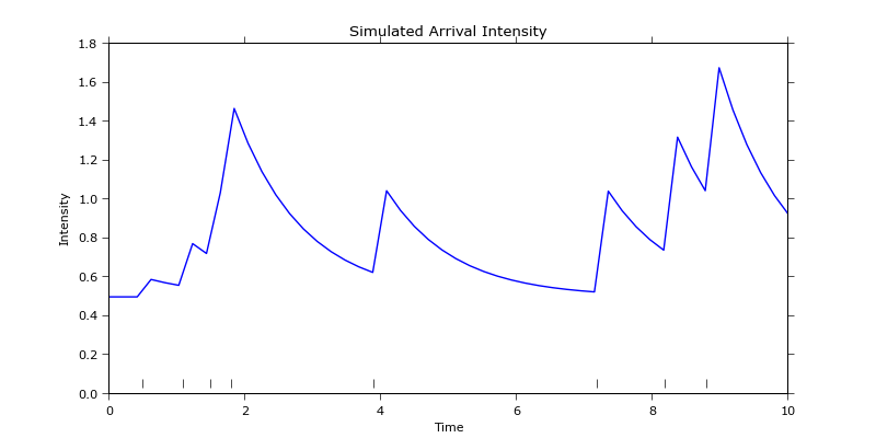
这会生成如下的拟合图:
 看起来一切都很好,但当你仔细观察时,你会发现简单地用一个交易数量的向量减去拟合的向量来计算残差是行不通的,因为它们的长度不同:
 不过,可以提取与记录的经验数据相同时间点的强度,然后计算残差。这样你就可以找到经验数据和拟合数据的分位数,并将它们绘制在一起,从而生成QQ图:
""" GENERATE THE QQ PLOT. """
" Process the data and compute the quantiles. "
orderStatistics=[]; orderStatistics2=[];
for i in range( empirical_1min.values.size ): # Make sure all the NANs are filtered out and both arrays have the same size.
    if not np.isnan( empirical_1min.values[i] ):
        orderStatistics.append(empirical_1min.values[i])
        orderStatistics2.append(conditionalIntensities[i])
orderStatistics = np.array(orderStatistics); orderStatistics2 = np.array(orderStatistics2);

orderStatistics.sort(axis=0) # Need to sort data in ascending order to make a QQ plot.    orderStatistics is a column vector.
 orderStatistics2.sort()

 smapleQuantiles=np.zeros( orderStatistics.size ) # Quantiles of the empirical data.
 smapleQuantiles2=np.zeros( orderStatistics2.size ) # Quantiles of the data fitted using the Hawkes process.
for i in range( orderStatistics.size ):
    temp = int( 100*(i-0.5)/float(smapleQuantiles.size) ) # (i-0.5)/float(smapleQuantiles.size) th quantile. COnvert to % as expected by the numpy  function.
    if temp<0.0:
        temp=0.0 # Avoid having -ve percentiles.
    smapleQuantiles[i] = np.percentile(orderStatistics, temp)
    smapleQuantiles2[i] = np.percentile(orderStatistics2, temp)

" Make the quantile plot of empirical data first. "
fig2 = matplotlib.pyplot.figure()
ax2 = fig2.gca(aspect="equal")

fig2.suptitle(r"$Quantile\ plot$", fontsize=20)
ax2.grid(True)
ax2.set_xlabel(r'$Sample\ fraction\ (\%)$',fontsize=labelsFontSize)
ax2.set_ylabel(r'$Observations$',fontsize=labelsFontSize)
matplotlib.rc('xtick', labelsize=ticksFontSize)
matplotlib.rc('ytick', labelsize=ticksFontSize)

distScatter = ax2.scatter(smapleQuantiles, orderStatistics, c='blue', marker='o') # If these are close to the straight line with slope line these points come from a normal distribution.

ax2.plot(smapleQuantiles, smapleQuantiles, color='red', linestyle='solid', marker=None, markerfacecolor='red', markersize=12)
normalDistPlot = matplotlib.lines.Line2D([],[],color='red', linestyle='solid', marker=None, markerfacecolor='red', markersize=12)

fig2.legend([normalDistPlot, distScatter], [r'$Normal\ distribution$', r'$Empirical\ data$'])
 matplotlib.pyplot.show()

" Make a QQ plot. "
fig3 = matplotlib.pyplot.figure()
ax3 = fig3.gca(aspect="equal")

fig3.suptitle(r"$Quantile\ -\ Quantile\ plot$", fontsize=20)
ax3.grid(True)
ax3.set_xlabel(r'$Empirical\ data$',fontsize=labelsFontSize)
ax3.set_ylabel(r'$Data\ fitted\ with\ Hawkes\ distribution$',fontsize=labelsFontSize)
matplotlib.rc('xtick', labelsize=ticksFontSize)
matplotlib.rc('ytick', labelsize=ticksFontSize)

distributionScatter = ax3.scatter(smapleQuantiles, smapleQuantiles2, c='blue', marker='x') # If these are close to the straight line with slope line these points come from a normal distribution.

ax3.plot(smapleQuantiles, smapleQuantiles, color='red', linestyle='solid', marker=None,     markerfacecolor='red', markersize=12)
normalDistPlot2 = matplotlib.lines.Line2D([],[],color='red', linestyle='solid',  marker=None, markerfacecolor='red', markersize=12)

fig3.legend([normalDistPlot2, distributionScatter], [r'$Normal\ distribution$', r'$Comparison\ of\ datasets$'])
matplotlib.pyplot.show()
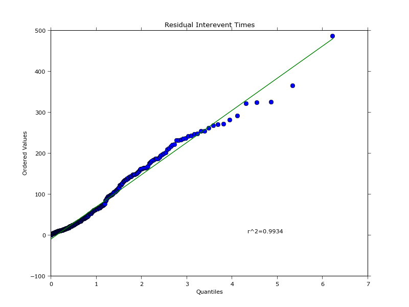
这会生成以下图表:


经验数据的分位数图与文章中的图并不完全相同,我不太确定为什么,因为我对统计学不是很在行。不过,从编程的角度来看,这就是你可以处理这些内容的方法。